Change This is changing this marketer.
The content being shared through these manifestos is better than practically all the books and magazines I read to generate new ideas, new thinking, and new anything. The challenge for us, the reader, is going to be filtering through all the great manifestos that are continuously being uploaded to the Change This site.
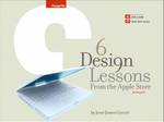
 Just today I ran across an EXCELLENT manifesto on designing retail experiences for customers. As a retail marketer, the Six Design Lessons from the Apple Store manifesto contains thought-provoking yet actionable strategic advice on designing and delivering compelling store experiences for customers.
If you are a retail marketer … this is a must-read. (Absolutely. No excuses. Read it today. Read it now.) And after reading … share, share, and share some more.
If you are a marketing thought-leader … I urge you to do the same.
For those time starved, here is my abstract of the Six Design Lessons from the Apple Store manifesto.
LESSON ONE: Create an Experience. Not an Artifact.
This attention to the customer’s line of sight is carried through the whole space. One thing completely obscured from view as you enter the store: the cash registers. It feels more like walking into a hands-on museum than walking into a retail store. Sure, Apple wants to sell products, but their first priority is to make you want the products. And that desire has to begin with your experience of the products in the store.
LESSON TWO: Honor Context
Instead of being organized according to product type — printers over here, cameras over there — the first floor of the store is organized by the context in which people use the products.
LESSON THREE: Prioritize your Messages
Instead of having to find a place for every message, Apple focuses on the handful of messages that count. Aside from a few strategically placed signs to promote upcoming events, most of the graphics in the store are more general in nature rather than trying to communicate some specific details; more decorative than informational.
LESSON FOUR: Institute Consistency
The Apple personality comes through every time the customer encounters the brand, whether on television, in print or outdoor advertising, or through interacting with one of Apple’s products. The Apple stores are no different, and Apple is able to project that personality across all these channels by maintaining rigorous consistency of design.
LESSON FIVE: Design for Change
Where rapid change needs to be accommodated, the Apple Store has mechanisms to support it. The front window displays are rigged using simple flat panels mounted on tracks and cables. This system allows the displays to be changed quickly and easily (and, one would guess, economically) while still allowing a diverse range of possibilities for grabbing the attention of passersby.
LESSON SIX: Don’t Forget the Human Element
A retail store isn’t just made up of shelves and tables and lights. The people who staff the store form an integral part of the overall experience. Apple Store employees don’t look like run-of-the-mill retail workers. Instead of name tags, they have business cards. And they all carry iPods on their belts, creating the impression that they don’t just work for Apple — they live the lifestyle Apple is selling to customers. Apple’s retail workers are brand emissaries.