Interesting stuff.
Dadrich is forthright is disclosing his Democratic political bent but he sets aside his political leanings to declare, “… President Bush as the frontrunner in the competition for best logo.” His in-depth analysis of the Kerry/Edwards logo reveals how its graphic design, “… displays the same inconsistency that his opponents accuse him of.”
Below is a scalpel/suture of Scott Dadrich’s Presidential logo autopsy from his NY Times Op-Ed piece. (Enjoy.)

The effect is striking, simple and progressive. The rightward lilt of the wide, capital letters reinforces Mr. Bush’s ideology while at the same time portraying a buoyant sense of forward movement, energy and positive change. The type is strong without being oppressive, nimble without being fanciful – a successful construction reminiscent of the 1992 Clinton-Gore logo. Add a simplification of the American flag – 20 stars and seven stripes – and a supportive “Cheney” in a smaller font underneath, and you’ve got a strong visual hierarchy that reinforces the candidate’s spoken message that he is a firm and resolute leader.
One outgrowth of the Bush logo is even better: the graphic sound bite “W,” which appears on bumper stickers. Americans are conditioned to equate visual brevity with success and power. One need only look at the landscape of corporate America for confirmation: the Nike swoosh, the CBS eye, Target’s bull’s-eye and McDonald’s golden arches. It’s appropriate that Mr. Bush allowed his middle initial to work for him, and a testament to the letter’s power that the opposition has co-opted it for its own use, though it is circled with a slash through it.

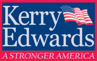
Some of my quibbles would be obvious only to typography gurus. But Mr. Kerry makes other, more noticeable mistakes. Rather than distinguish his candidacy, his logo’s Reflex blue background serves only as a weak echo of the president’s bolder navy. Mr. Kerry’s flag is free-floating and leans backward, while Mr. Bush’s flag is anchored to his name and leans forward. Add to this a claustrophobic red border that prevents the eye from moving upward and onward and you’re starting to see the visual poverty of this campaign.
The American flag in the Kerry-Edwards logo is the biggest gaffe of all. Although it has the requisite 50 stars, there are five rows of 10 stars, rather than the correct arrangement of five rows of six stars and four rows of five stars. It looks like a mistake – not a stylized interpretation, like the flag in the Bush logo.
Now, close your eyes and count to three. Look at the Kerry-Edwards logo above. What word do you see first? That’s right: “Edwards.” This is because the name of the vice-presidential nominee is placed beneath the “Kerry” in the same type and size, causing it to occupy more space. (And it’s not just because Edwards is a longer name than Kerry; though Cheney is longer than Bush, their logo doesn’t have that problem.) Talk about message confusion! The inelegant stacked Helvetica Iteration of the Mondale-Ferraro ticket of 20 years ago was almost as bad – and we know how that race ended.
- Brand Autopsy posting | Brand Mapping the Presidential Candidates