Most every marketer who has worked on creating ads, signage, and anything else promoting their business knows the Logo Test. It’s a simple test to determine if the marketing piece you’re working on uniquely communicates your business or brand.
To conduct a Logo Test, simply replace your company’s logo for a competitor’s logo in the marketing piece.
A brand fails the Logo Test when you can swap out your logo for a competitor’s logo in any piece of marketing collateral and it looks just fine.
In 2007 I wrote how Starbucks failed the Logo Test with its “Pass the Cheer” national television advertising campaign. The commercials failed the Logo Test because if you swapped out the Starbucks logo for the Caribou Coffee logo, the commercials still worked. (I believed the commercials worked BETTER as a Caribou ad than a Starbucks ad. That’s really failing the Logo Test.)
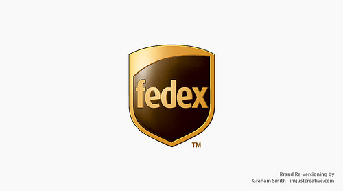
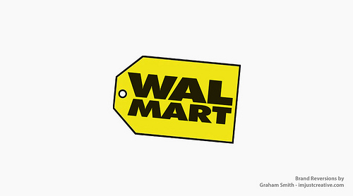
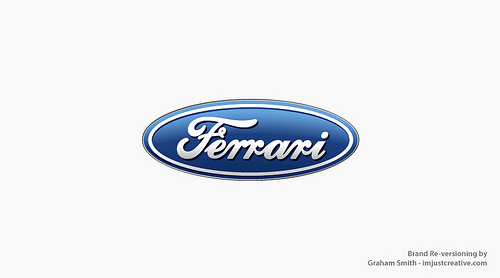
Graham Smith, logo designer from imjustcreative, puts the Logo Test in action with his Brand Reversion series. Brilliant stuff!
Graham visually shows how reversing brand visual styles changes everything.
He has a growing gallery of Brand Reversions on Flickr. Check them out and see which brands clearly pass the Logo Test and which ones don’t.
View more brilliant Brand Reversions from Graham Smith on Flickr.


