UPDATED [Nov. 27]: Starbucks has posted all three of their Holiday television commercials online. You can view them here.
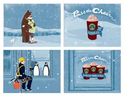
The “Bear Hug” and “Window Washer” spots continue the good Samaritan “Pass the Cheer” angle with the major difference being the focus on the Starbucks Red Cup. The Red Cup is so much more recognizable as being Starbuckian than is the red Christmas Blend whole bean bag (seen in the Ski Lift ad).
As a marketer, I would like the closing shot on these two spots to linger a little longer. Both of these new commercials close with the Red Cup holiday beverage focus. However, the closing payoff shot feels rushed. Not enough time for us viewers to read, understand, or connect with the copy on the draped banner. They could have easily shaved off a second or two in the build-up and added it to the closing payoff shot for more effectiveness. Have a look for yourself. Click below…

>> original post <<
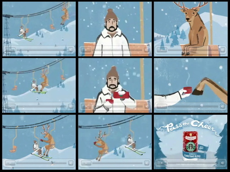
Lots of c-h-a-t-t-e-r about the television spots Starbucks is running. I haven’t seen them on the tele, but Starbucks has posted one spot online.
Click below to watch the commercial….

Hmm … okay. Starbucks waited 36-years for this? It’s nice. It’s benign. It’s subtle. Can’t see how this spot will drive in new customers, nor drive current customers to come in more often during the Holidays. (And yeah, I know this is just one component to the overall Starbucks Holiday promotion.)
What’s your take? Does this television ad make you feel any different about Starbucks? Does it make you want to visit a Starbucks and buy some Christmas Blend?
UPDATE:
In the comments section, Scott questions how this TV spot syncs up with Starbucks brand identity.
Great point. The missing ingredient of Starbucks first national television commercial is brand identity. This spot feels more appropriate for Caribou Coffee than it does Starbucks. (For those unaware, Caribou Coffee is the second largest coffee retailer in the US. According to Wikipedia, Caribou has over 460 locations in 18 states.)
Caribou’s brand identity is wrapped around the cozy ski lodge concept as well as the leaping deer in its logo. The in-store décor of a Caribou Coffee location is reminiscent of a ski lodge, complete with exposed weathered wood and comfy chairs around a fireplace. (Photos here, here, and here.)
The leaping deer, which easily passes for a reindeer during the Holidays, is as iconic to Caribou as the Siren is to Starbucks.
Additionally, Caribou uses a pastel aqua-blue color as part of its brand identity.
So upon further review, this commercial from Starbucks works better for Caribou Coffee than it does for Starbucks. Ski scenes are more associated with Caribou than Starbucks. A deer is more linked to the Caribou brand than the Starbucks brand. Caribou’s color scheme has always been drenched in an aqua-blue color, while Starbucks color scheme hasn’t.
Upon even further review, this Starbucks commercial fails the “Logo Test.” If we were to swap out the Starbucks Christmas Blend bag at the end of the spot and replace it with Caribou’s Reindeer Blend, the commercial would still work just fine. Anytime you can swap out your logo for a competitor’s logo in any piece of marketing collateral and it looks fine, you have a problem.
So … Starbucks, with its first national television commercial, has made a great ad for Caribou Coffee.